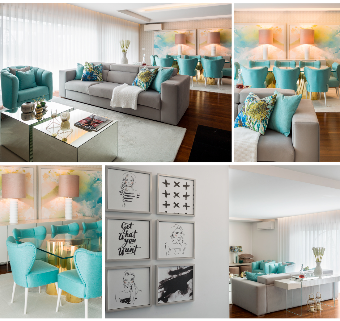
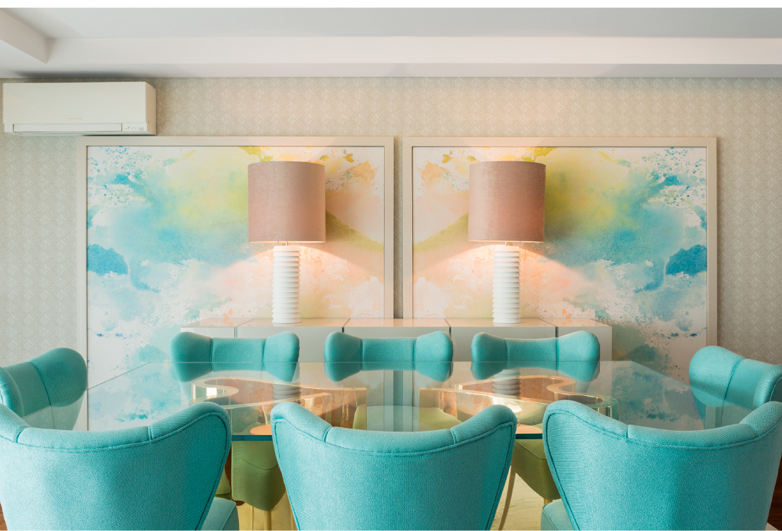
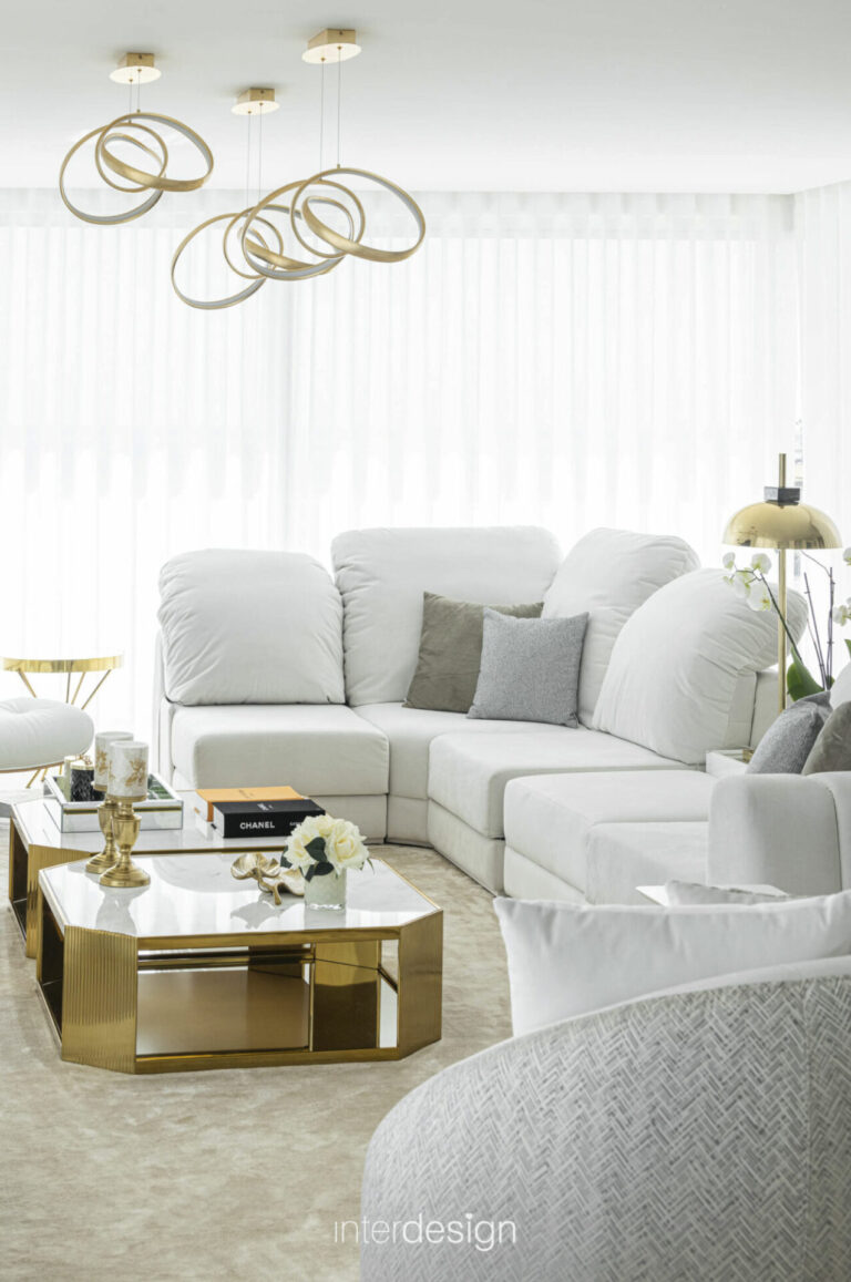
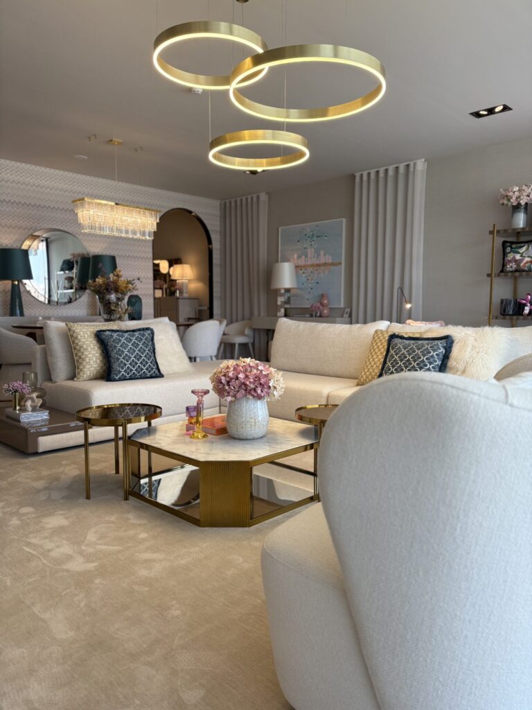
Common Room
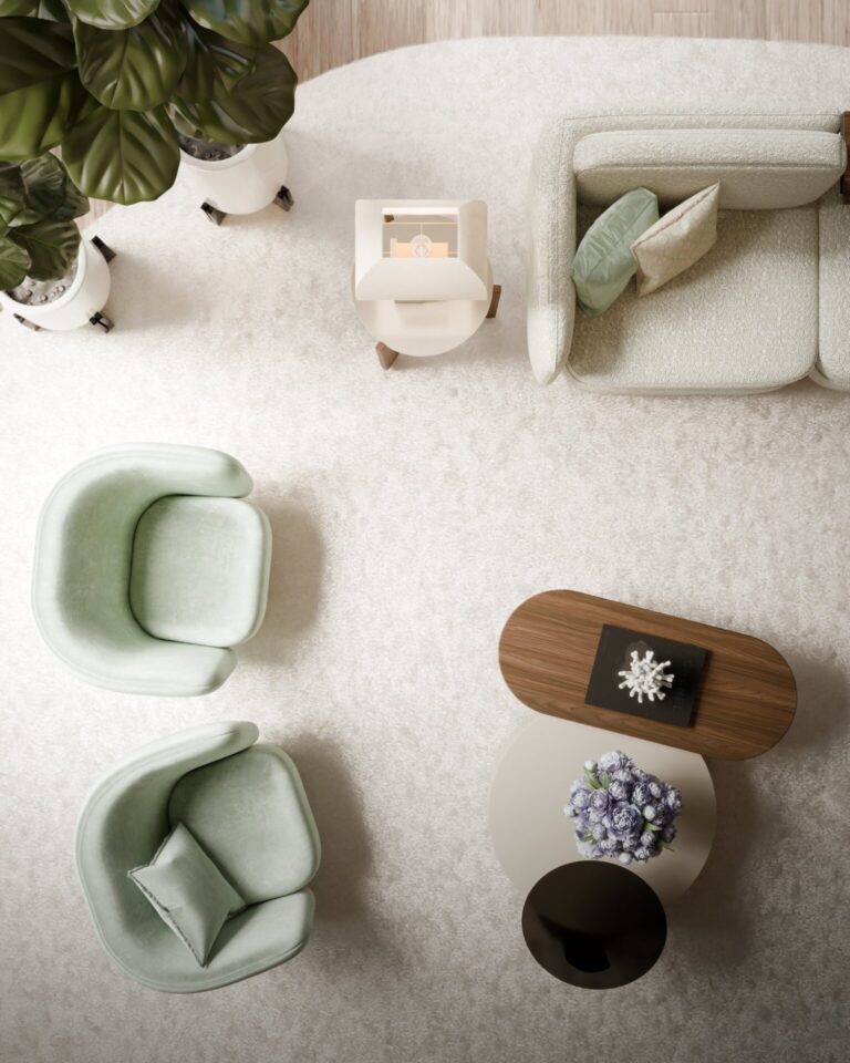
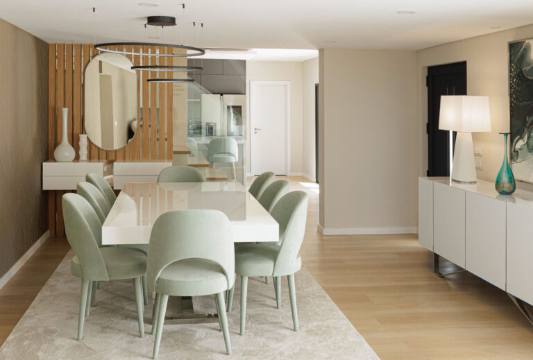
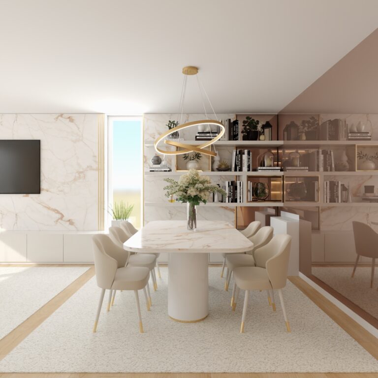
After analyzing the floor plan, we began by defining strategies and objectives. The living and dining rooms share the same space. It was important for these two areas to coexist harmoniously. Both rooms are spacious and bright, with large windows that allow a perfect connection with the outdoors.
The clients knew exactly what they wanted: nude and neutral tones. They wanted spaces that were light, modern, comfortable, yet fun at the same time. Following these guidelines, we decided to place the ‘big furniture’—sideboard, TV unit, and sofa—on a neutral base, and then add splashes of color to all the elements that could be easily changed according to the clients’ mood, such as cushions, lampshades, etc.
The choice of aqua green as a color element evokes the pool water and the vast lawn that stretches outside the property. It’s as if the outdoors ‘enters’ the interior of the home, bringing it life, light, color, and a lot of vibrancy.
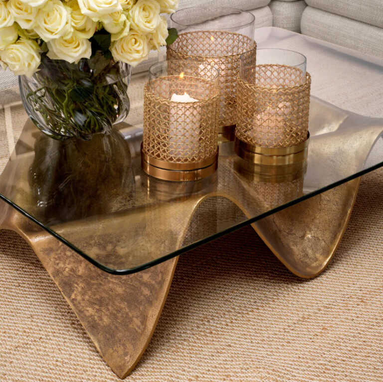
In the living room, we chose to install a geometric wallpaper so that the generous walls would gain new life, creating a cozier space. The dining table is our faaantaaastic AMOUR table, which, with its gold leg, makes the environment more luxurious and refined! It was always the clients’ first choice…
Elegance is in the details, and the clients LOVED it!
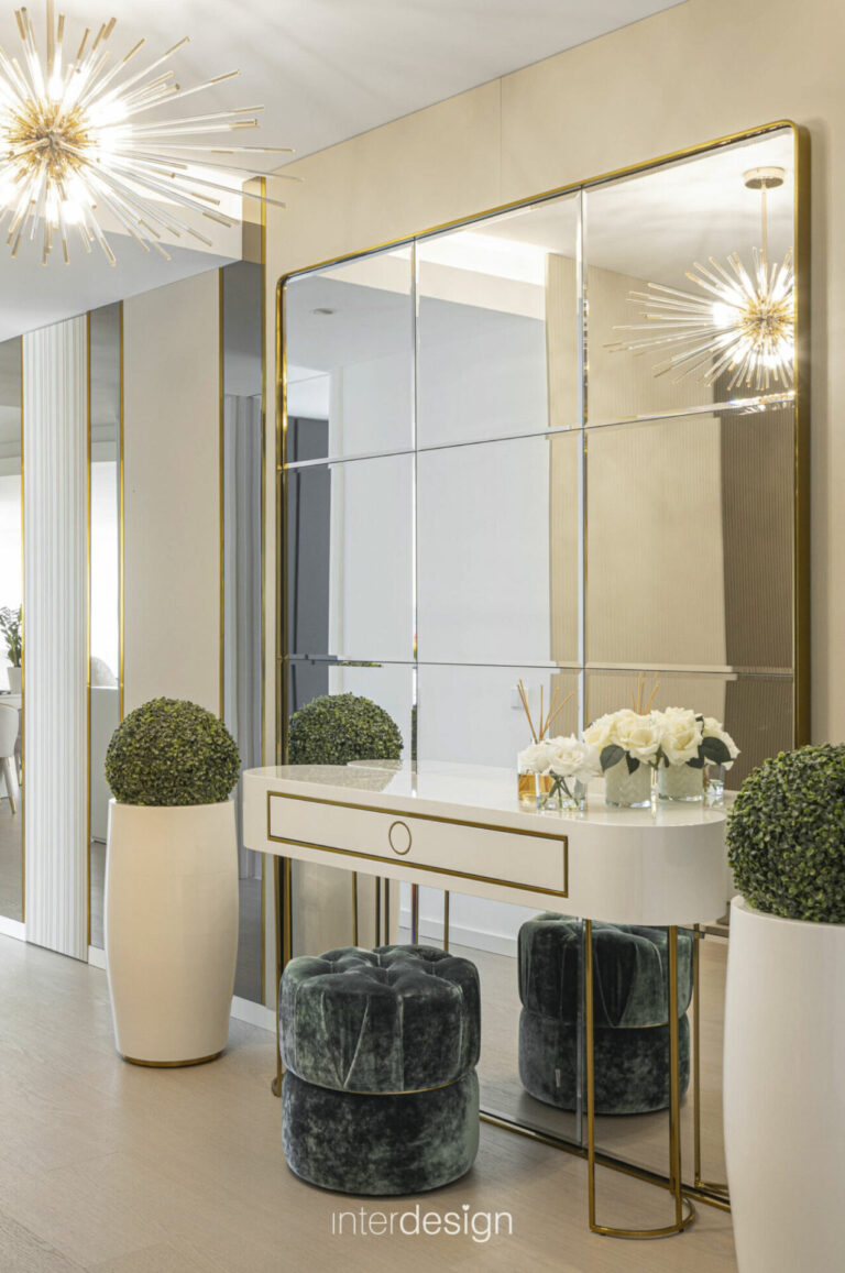
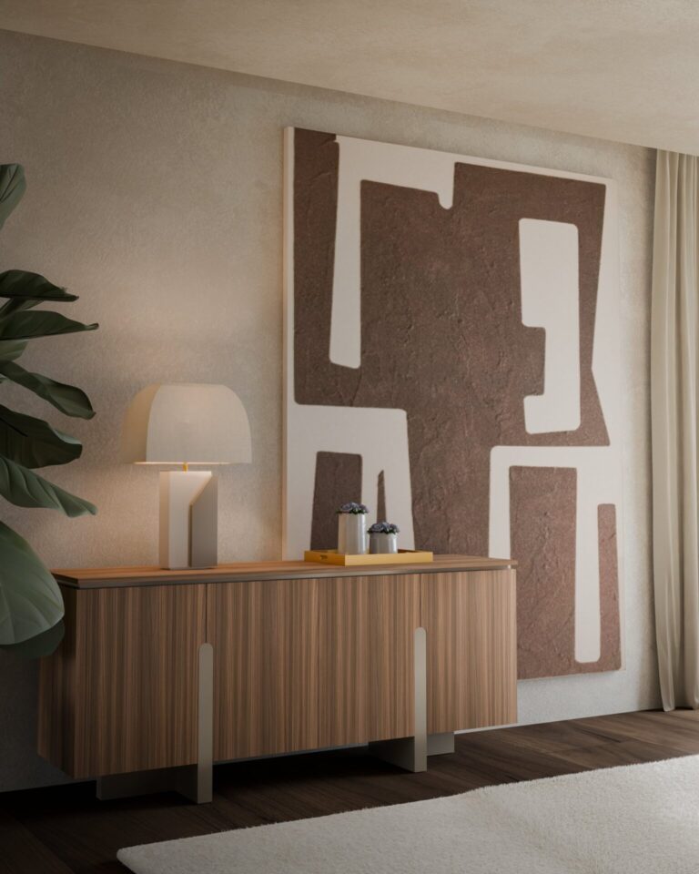
Hall
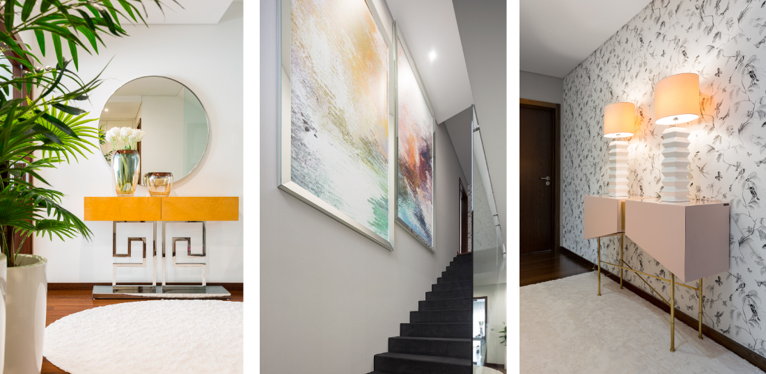
Both in the entrance hall and in the hallway to the bedrooms, the clients wanted to take risks, as these two areas are transitional rather than for lingering. Using colorful furniture or more elaborate wallpapers was key to achieving the desired environments.
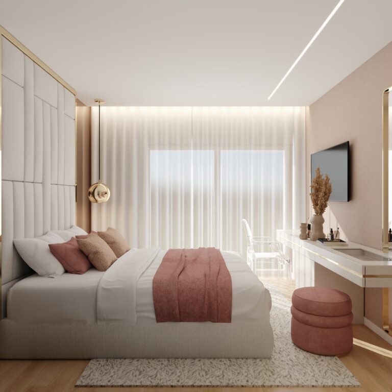
Bedrooms
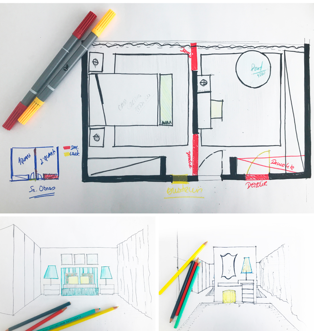
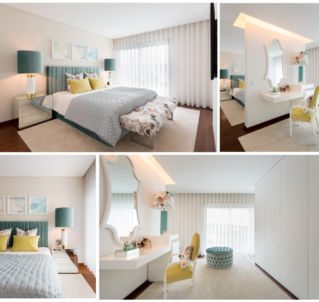
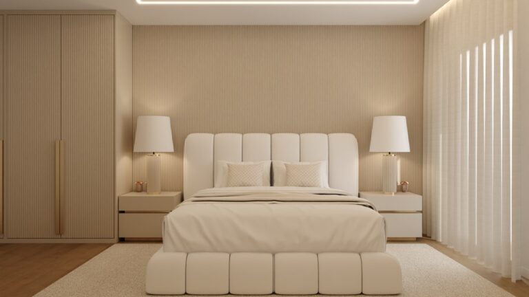
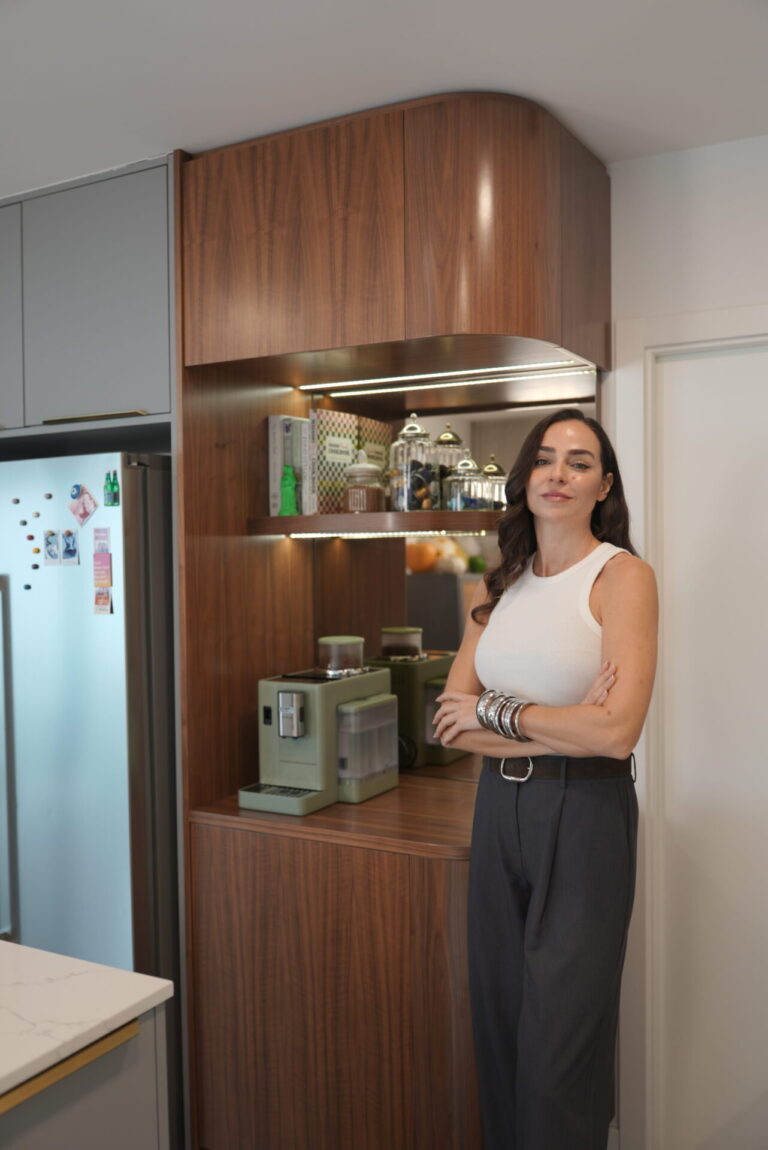
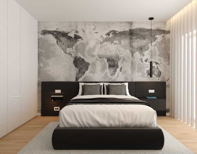
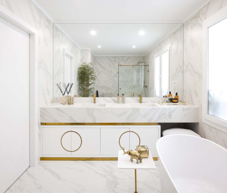
On the first floor is the private area. Generously sized, the master suite is the result of the demolition of a wall. Where there were initially two bedrooms, there is now a large ‘presidential suite,’ comprising a sleeping area, bathroom, and walk-in closet. It is an integrated space, full of comfort and rich in details.
Another beautiful work by our Mr. Works!
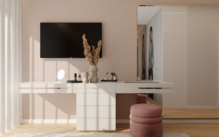
One of the client’s requirements was that her room and her daughter’s room include dressing tables where they could place jewelry and ‘girly things’!
In addition to wanting all the décor very neutral, the parents allowed their two ‘PETITS ENFANT’ to choose the theme for their rooms.
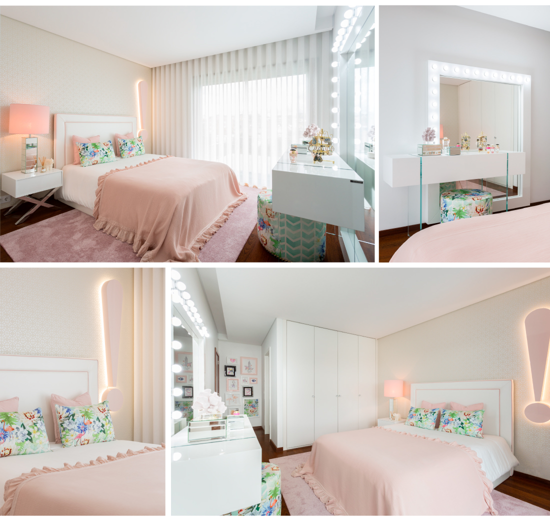
Girl
For the Princess, ‘PINK’ was a must. The sweetness and softness make you want to stay there forever. Better than a thousand words, we’ll let the images speak for themselves!
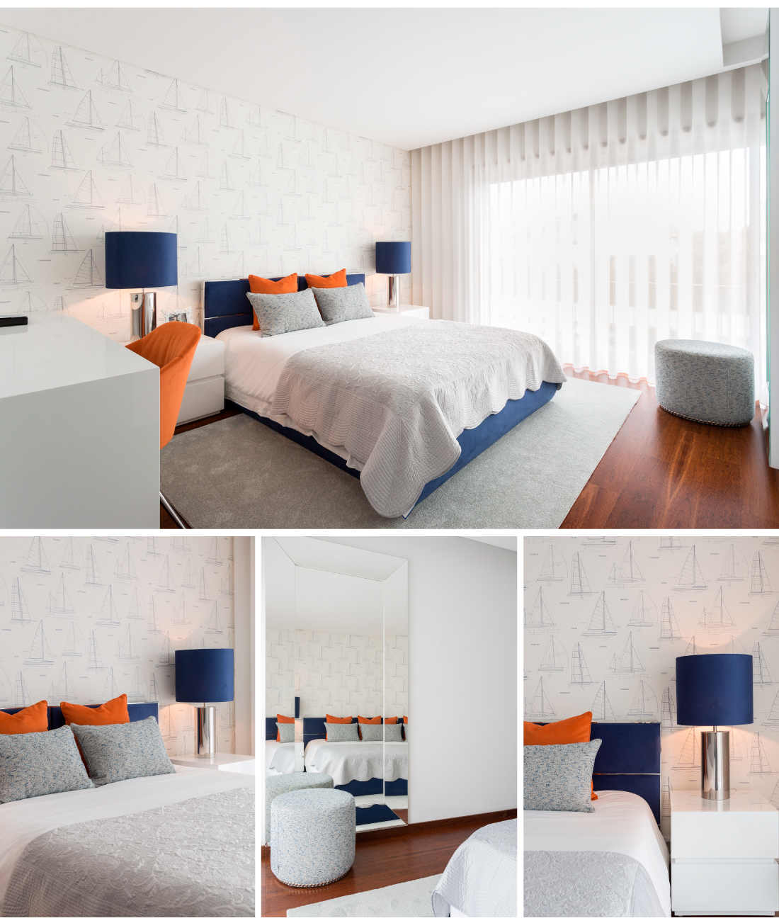
Boy
For the little rascal, we created a space far from the smallness that still defines him, yet very close to the pre-teen he is becoming. Blue and orange, a perfect combination!
THIS HOUSE IS WITHOUT A DOUBT a reflection of those who live there. We made another family HAPPY…
For Interdesign, no dream is impossible!
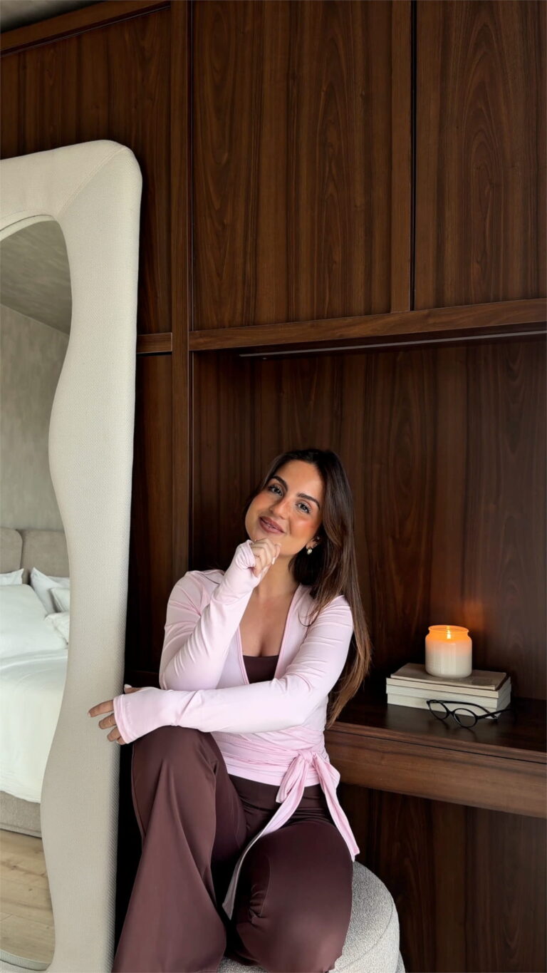
Share this post
We use cookies to improve your experience on our site. By using our site, you consent to cookies.
Manage your cookie preferences below:
Essential cookies enable basic functions and are necessary for the proper function of the website.
Design within your reach
Explore a selection of pieces with exclusive conditions, thoughtfully chosen for you, for a limited time.
Room
From Vision to Reality
Discover ideas, explore our work, and see how vision becomes reality — simply, clearly, beautifully.
It’s not just 3D.
It’s where your project begins, with a space designed entirely around you.
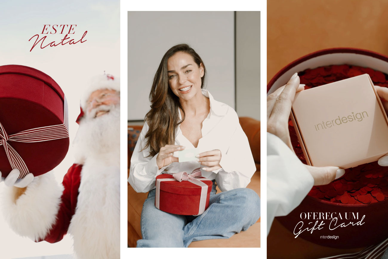
The perfect gift for this Christmas
The Interdesign Gift Card is the ideal choice to offer design, elegance, and freedom of choice. A timeless gift to delight during this special season.